Colour is sensory and emotional. We perceive it immediately and directly, without going through the mindset filter.
In the design sector and when you create a custom website, the subject of colour is delicate and controversial. We don’t know exactly its degree of influence, as people fell it differently depending on different parameters.
In any case, it’s necessary to tackle the colours issue for your website design.
They convey an implicit message to your website visitors thanks to:
👉 their meanings
👉 their connotations
👉 the emotions they arouse
That’s why we’ll discover how to use colours in web design by answering these questions:
Are you ready to know if there is a treasure at the bottom of the rainbow? Let’s go!
Choosing your website colours: what you need to know
It’s difficult to understand the influence of the colours, as they beggar belief. Therefore, choosing colours is a difficult but very interesting work.
Choosing your website colours will have an impact on the perception of your brand by your visitors and their behaviour.
Choosing colours judiciously enables to fix more your brand and website in users’ mind.
Don’t choose the colours of your website according to your taste, but choose them thinking about the emotions you want to arouse in your users.
Do you want to reassure, fill with enthusiasm, galvanize, make your users dream, laugh or attract them?
In general, bright, warm colours stimulate and galvanize, contrary to deep, cold colours that reassure.
However, users interpret colours differently. That’s why it’s interesting to know colours’ meaning for each custom creation.
The important elements to choose your colours
To not make a mistake and choose the right colours for your website, you must take these elements into account:
The business sector of your website
Colours can connote something different, depending on context.
For example, pink can represent romantic love on a dating website, or suggest early childhood for a nursery or baby garment website.
Here is another example: blue adapts to a computer company and a website of hygiene products.
Your target audience
As mentioned above, your public will mainly decide how to choose your colours for web design.
You must take these parameters into consideration:
Pay attention to the symbolic meaning of your colours, as they can change depending on the target country. For example, in France, black is the colour of mourning or luxury. In India, it symbolizes health and in Thailand, it represents bad luck.
White is the colour of purity in France and represents death in the East.
Finally, green is the colour of lying in China.
In general, ensure that all your target audience understands everything which is related to your identity and website in the same way.
The perceptions and interpretations of the different colours can change depending on your public’s age and gender.
Here is some information about colours to help you choose them:
👉 Men, women, children, and adults like blue, but it’s also a colour that many brands and websites choose.
👉 Brown and orange are less appreciated colours.
👉 Most of the population doesn’t like cold colours.
👉 The elderly population doesn’t like orange and yellow.
Your competitors’ colours
Spying your neighbours is fun in daily life, but it’s important in business.
To that end, you must analyse your competitors.
Type your business sector into Google Photos: you’ll directly have an overview of your direct competitors’ colours, and you can also visit their websites.
You’ll probably notice that these brands use the same colours and similar shades. Try to understand the reasons why your competitors chose these colours:
-
Do they want to make them uniform compared to the other brands of the same sector?
-
Are the most relevant colours to illustrate your business?
-
What was their thought process?
-
Is it coherent with your website, brand and visual identity?
For example, let’s see the logos and colours of most of the cafés chose.

Obviously, warm colours are mostly verging on brown and orange.
We can see touches of blue, green and dark pink.
Even if these warm colours refer to café heat and colour as well as the convivial moment with a café, you probably have the impression that these logos are similar.
One of the most famous brands of this sector has taken the opposing view for its logo:

Starbucks and its green logo dominate the sector of coffee sales without orange and brown shades.
In conclusion, don’t choose the same colours as your main competitors so that people don’t mistake you for them, but don’t totally reject the colours most of the actors of your business sector have chosen.
You must qualify your comments and examine the relevancy of these choices.
In this way, you find your colours that also enable you to stand out.
Colour meanings
Colours also have subtler meanings: symbolic and emotional, they affect people much more deeply than is commonly believed. Here is general information about colour meaning:
👉 Blue evokes calm, serenity, truth, and freshness. It’s also the colour of uniforms. Therefore, they remind us of authority as well as a form of masculinity. This is a ‘corporate’ colour which combines with new technologies and travels.
👉 Yellow is a joyful and stimulating colour, which we usually associate with the sun and light. Be careful! Light yellow can refer to disease, and babies don’t like bright yellow. As it’s a punchy colour, use it cautiously. Food-processing, tourism, and information sectors use it.
👉 Red is an ambivalent colour. It’s the colour of passion and love, but also the colour of blood and violence. It refers to speed, power, and combines with brown, black, and white. The luxury, erotism, sport, and gastronomy industries use it. It would increase appetite, and speed up heart rate.
👉 Green is the colour of nature, but also the colour of health, chance, and hope. It combines with ochre and brown perfectly. Environment, exploration, adventure, travel, education sectors often use this colour.
💡 Green is the most visible colour in the dark.
👉 Orange is an optimistic and stimulating colour you must cautiously combine with red and yellow.
👉 Purple is a colour you may find difficult to combine within a custom creation. It refers to spirituality, melancholy, discretion, eccentricity, and loneliness. It also represents esotericism, feminity, studies, culture, etc.
👉 Brown is a neutral, reassuring, simple, and rustic colour that refers to animal and vegetable kingdom as well as land and pragmatism. However, it may be a bit bland or refer to dirt. It combines perfectly with old rose.
👉 Black, just like white, cannot be properly defined as a colour. It’s neutral, and refers to sobriety, luxury, elegance, sadness, darkness, mystery, and mourning. It combines with each colour perfectly.
👉 White refers to purity, perfection, freshness, and cleanness. It may combine with each colour, but it may seem empty and dull.
👉 Gray is light, calm, ordinary, and elegant, but it may seem sad in excessive quantities. It refers to objectivity, compromise, sophistication.
👉 Pink is the colour of femininity, children, greed, and romantic love. It is dynamic with a hint of delicateness if used very sparingly.
Knowing how to combine your website colours
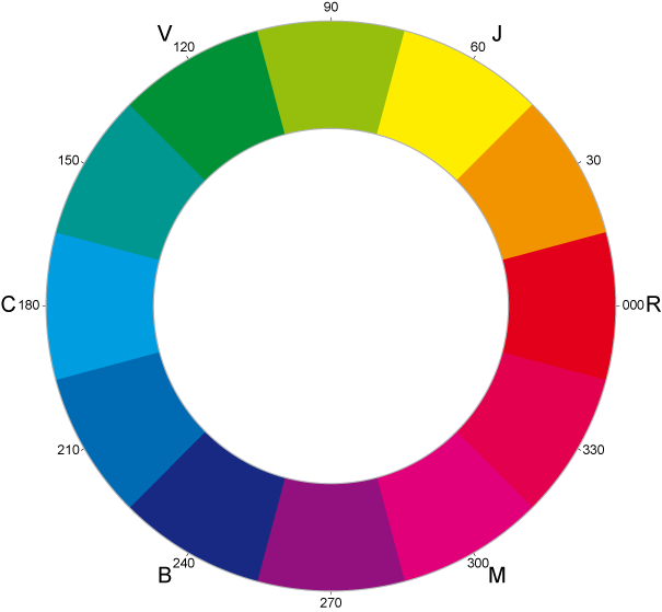
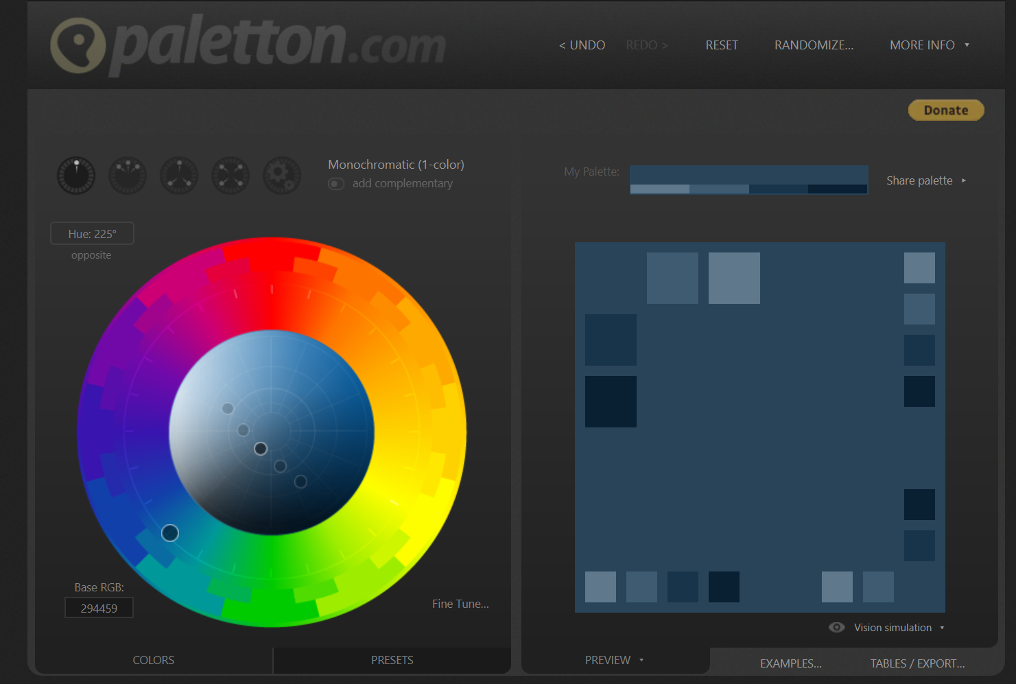
Some colours combine better than others. You can use a palette (also known as colour wheel) to define the complementary colours of a specific colour, and thus create a beautiful composition.

However, use a few colours. If colour can give a lift to your website and grab users’ attention, using too many colours can also make visitors confused. It’s better not exceeding 5 colours on a website.
💡 90% of worldwide companies just use 5 colours! What are these colours? Blue, red, pink, black, and green.
For a perfect colour combination on a website, you can choose two plain colours, and a third contrasting colour for call to action, for example.
Here are examples of interesting colour combinations:
👉 Dark green and yellow:
Combining dark green or teal blue with mustard yellow is modern. You have an interesting and nice contrast between a warm colour and a cool colour thanks to each colour shade.
👉 Burgundy and beige:
It’s also possible to combine a powerful colour with a pastel colour, such as burgundy and beige.
However, keep a higher proportion of light colours: a dark-coloured website makes reading unclear.
👉 Cool blue and grey:
As seen above, the public likes cool colours. You can emphasize this aspect with two cool colours such as blue and grey.
Ensure you gauge colour intensity in order not to dampen your visitors.
👉 Pastel colours:
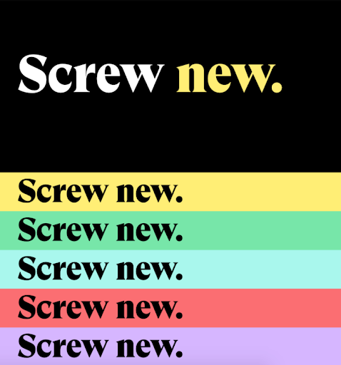
Pastel colours are trendy and make part of the current web design trends. They enable you to combine several colours without straining on the visitor’s eye.
For example, Back Market, the resale website is been using pastel colours since the redesign of its graphic charter:

Create a dazzling website
You know colour meanings perfectly, and you have many ideas of interesting combinations.
Now you just need to put theory into practice with the following tools!
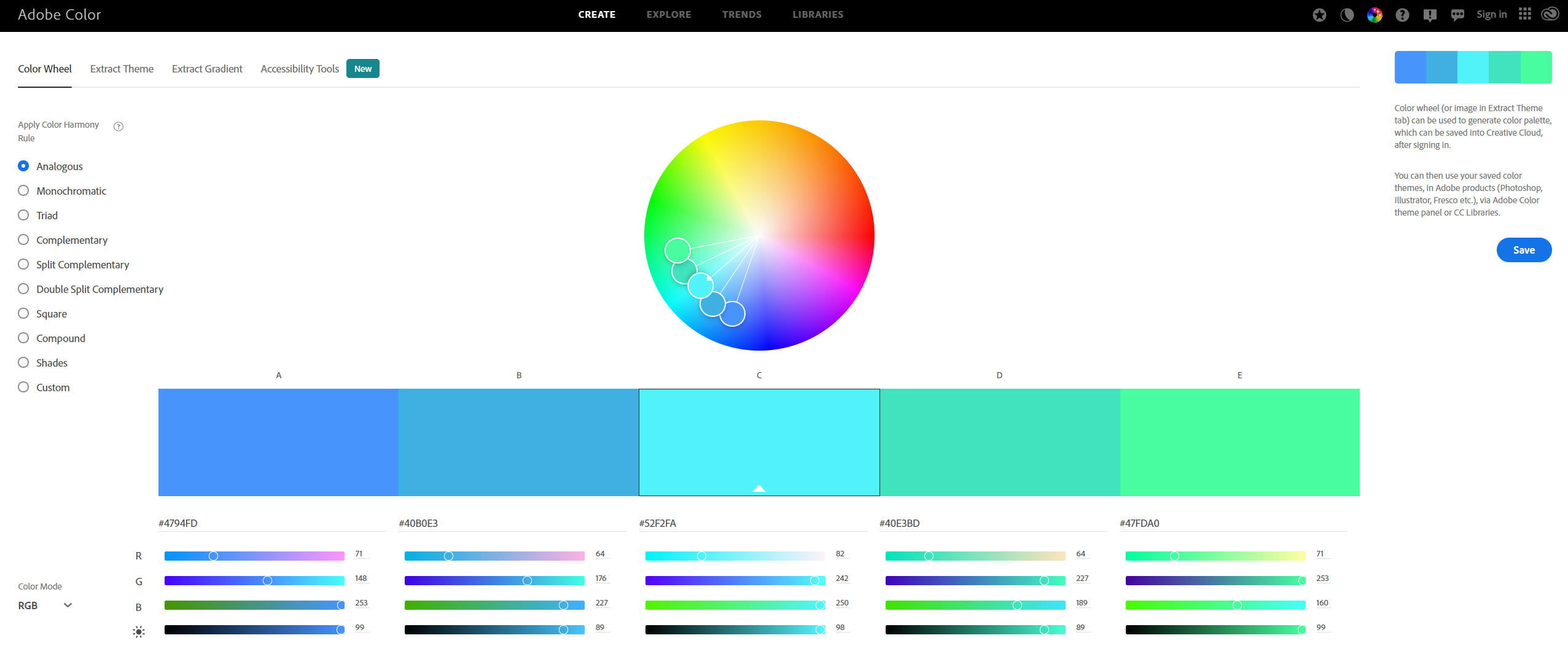
To create the colour palette of your website, you can use different online tools.
Look no further! Here is our selection of the best online tools, with their strengths and weaknesses:
✔️ This free tool is very complete with several configurations to search different colours.
❌ You can export your palette in a single format which is specific to Adobe: .ase. If you want to ensure compatibility with all platforms, you must keep the colour codes of your shades.

-
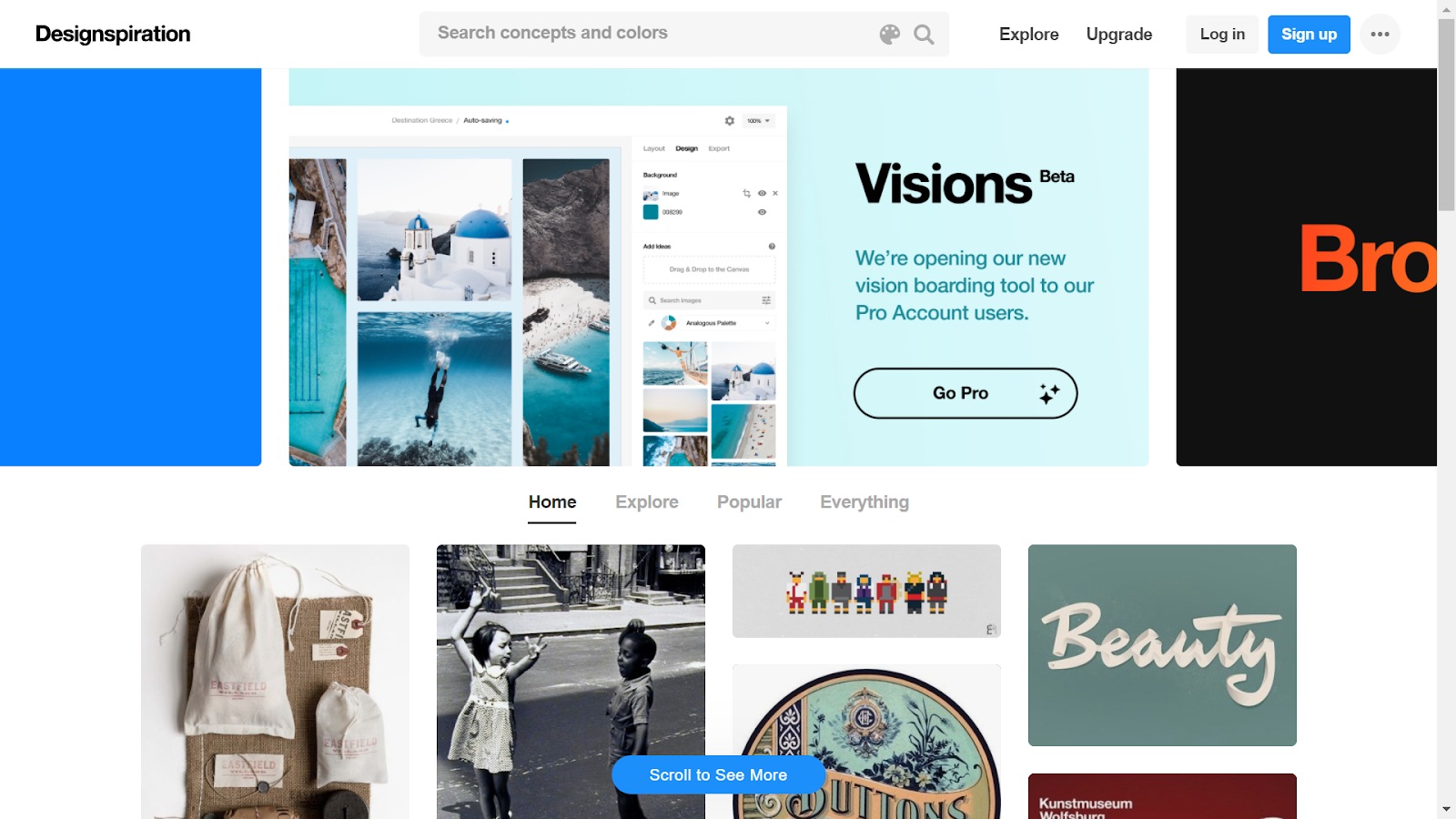
Designspiration enables you to look through colours, gradients, textures, and images the community offers you to be inspired.
✔️ For each inspirational photo, you have direct access to coloured palettes without searching colours from a photo on another website.
❌ When you search by colours, you can’t enter the code of a colour you like. You must find it on the colour spectrum you have at your disposal.

✔️ This tool offers you a wide range of shades for a specific colour.
❌ The generator is less user-friendly and beautiful than other tools.

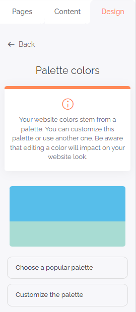
- The colour palette of SiteW! This tool enables you to see and select combinations of harmonious colours for your website, in just one click. You’ll find it in the “Overall style” section of the green Design panel.

The Palette tool offers you two possibilities:
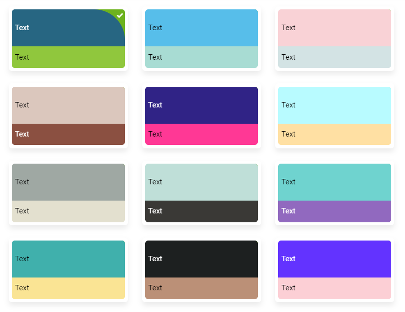
👉 You can draw your inspiration from trendy palettes in this section: “Choose a popular palette”.

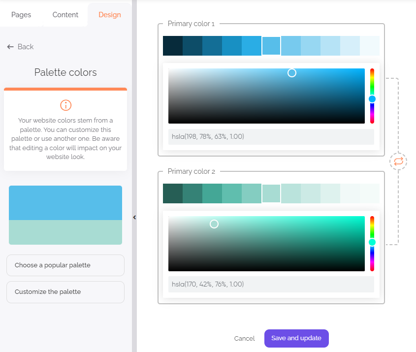
👉 Or you can create your palette by using the colour chart from a main colour.

Now you know more about colour meanings and how to use them to choose the colours of your website. You can also choose predesigned templates, directly on dedicated websites, according to the chosen colours.
With your brushes and palette, you are ready to follow these tips on your canvas (your website) and create your masterpiece.
Make an impression on us! 🎨


