Do you have a "responsive" website?
Responsive web design consists of creating websites with a mobile display; that is to say a display fit to the screen width available, and especially to the screen of smartphones.

As you can see on these statistics, nowadays it’s a major issue. So, let’s see in this tutorial how SiteW helps you to create a website optimized for mobile devices and tablets. Do you have a 'responsive' website? Be ready to say yes!
Automatic mobile view
In general, no action is required on your part as the automatic mobile view is activated in the SiteW editor as its default.

An algorithm creates the automatic mobile view and analyses blocks’ position on each page to deduce an optimum organization for smartphones.
Example

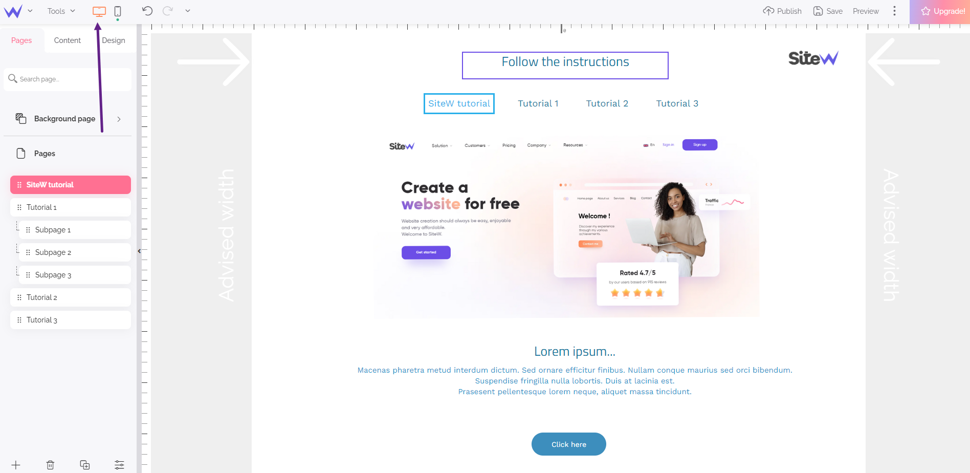
Desktop view for the page of the tutorial Create a header for your website

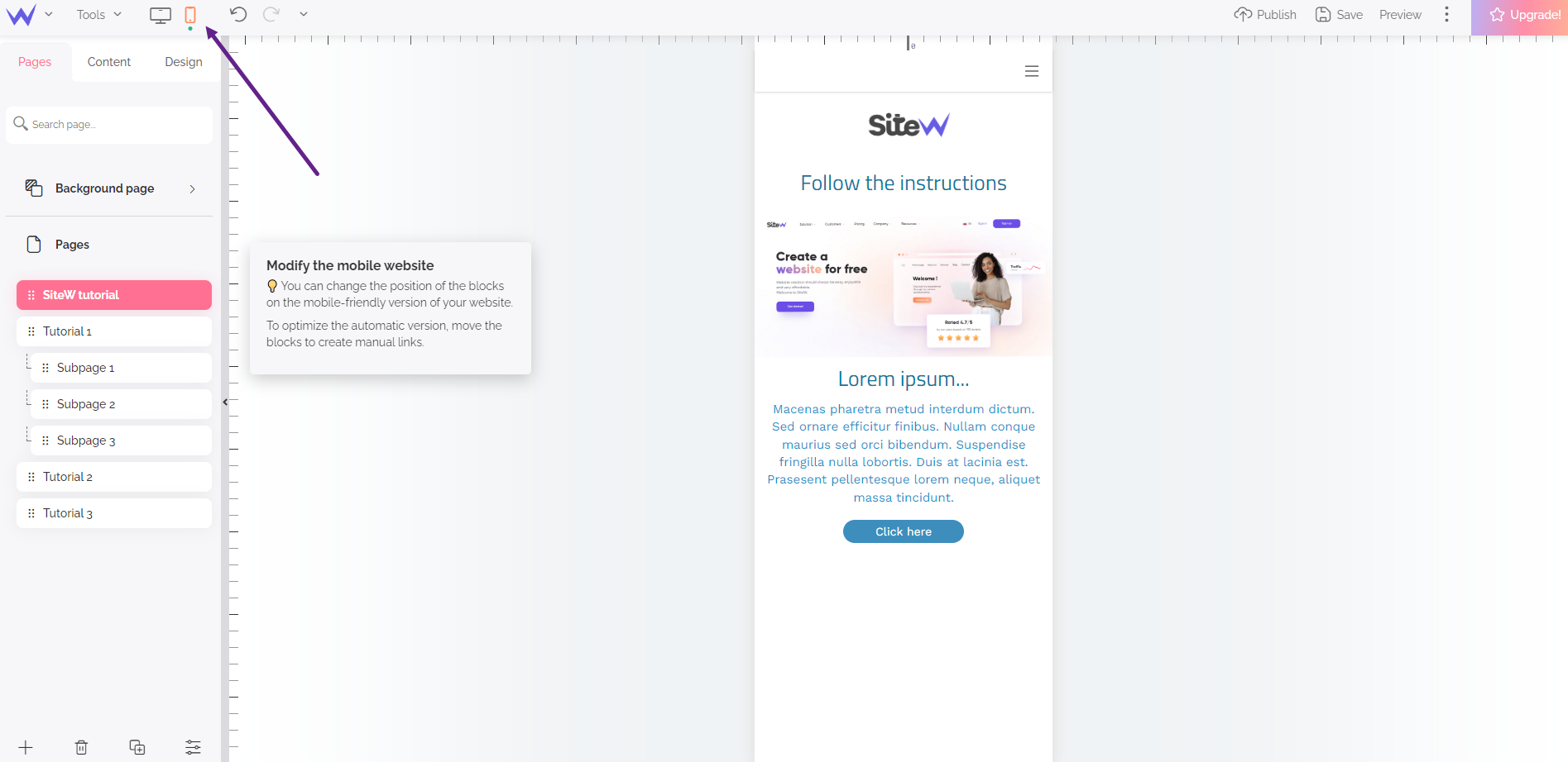
Automatic mobile view for the same page
Customization for the automatic mobile view
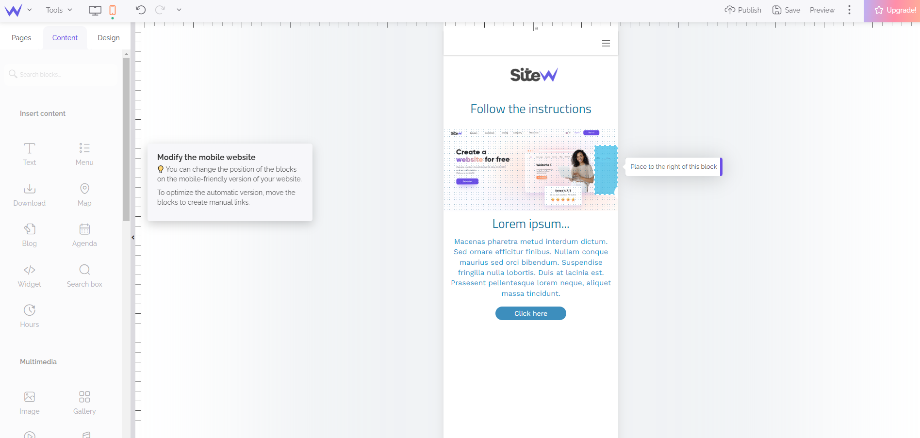
If you prefer, you can change the organization the algorithm automatically offers! You can create manual links between blocks to show to the algorithm that a specific block must always stay above, below, on the left or on the right of another block. These manual links are automatically created by dragging and dropping a block on the edges of another block.

For more information on the automatic mobile view, read the following guide: Create a mobile website automatically.
Manual mobile view
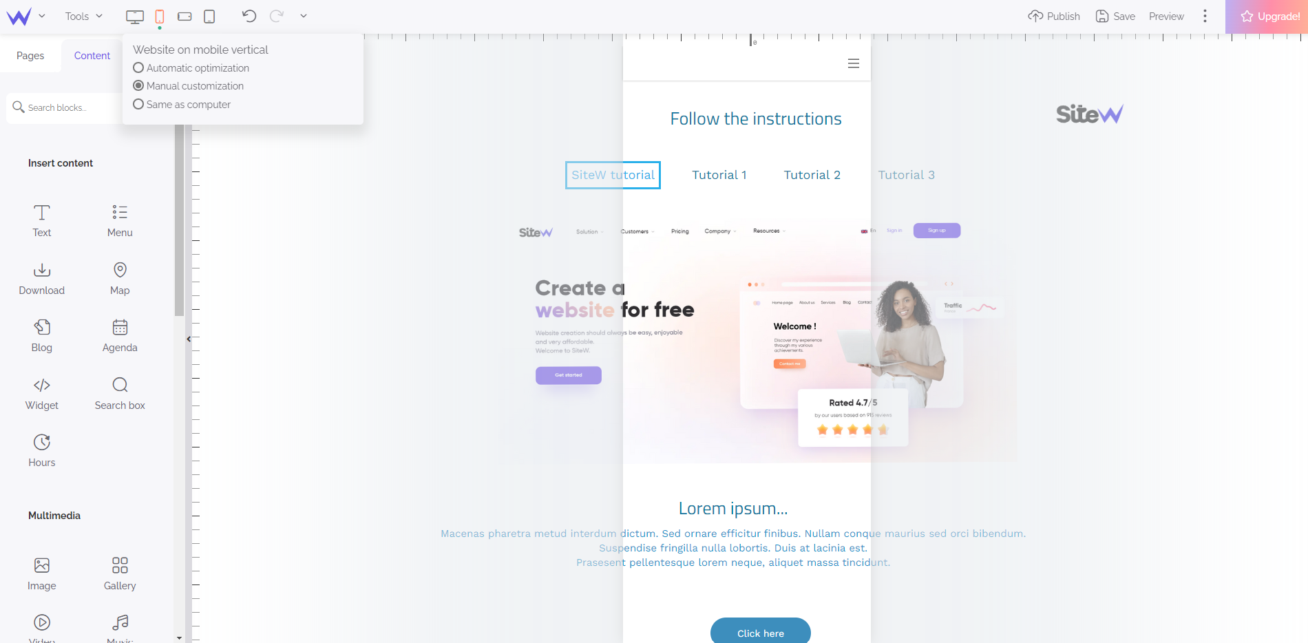
If blocks’ organization in the automatic mobile view doesn’t suit you, you can choose manual customization. In this mode, you can freely create a full custom ‘responsive web design’.

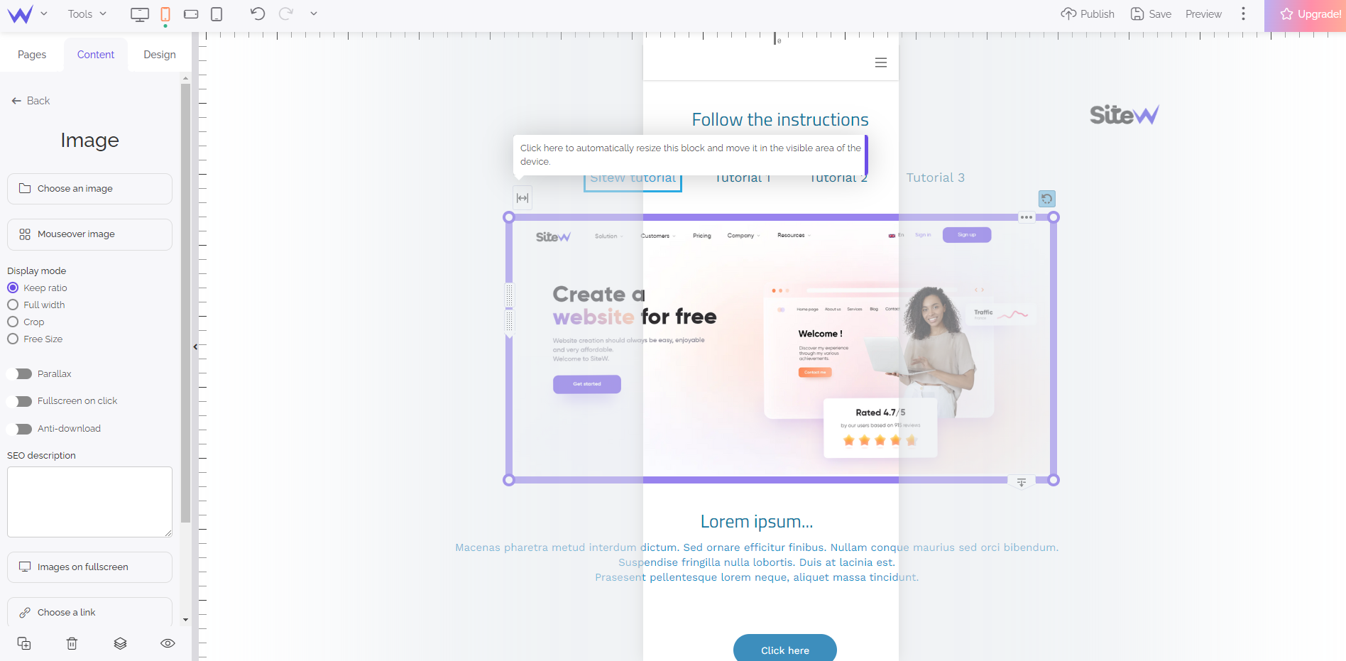
When you activate manual customization, you see the blocks of the page as positioned in the desktop view: so, it’s likely blocks protrude to the left and the right of the smartphone screen.
You can organize, position and fit blocks to the screen width quickly, thanks to this additional tool that appears on the blocks’ selection frame:

This handle enables you to automatically position and resize the block between both left and right edges of the mobile view.
Horizontal mobile view, vertical and horizontal tablet view
By choosing the manual mobile view, you enjoy two additional views: the horizontal mobile view and the vertical tablet view. The horizontal tablet view is always the same as the desktop view.
Please note that blocks’ position and size are independent for each view. For example, moving a block on the mobile view doesn’t impact on its position on the desktop view.
Pay attention to blocks’ layout!
If blocks’ position and size are independent for each view, that’s not the case for blocks’ layout. For example, if you change a text’s font size on the mobile view, this change will also be used on the desktop view.
Block visibility
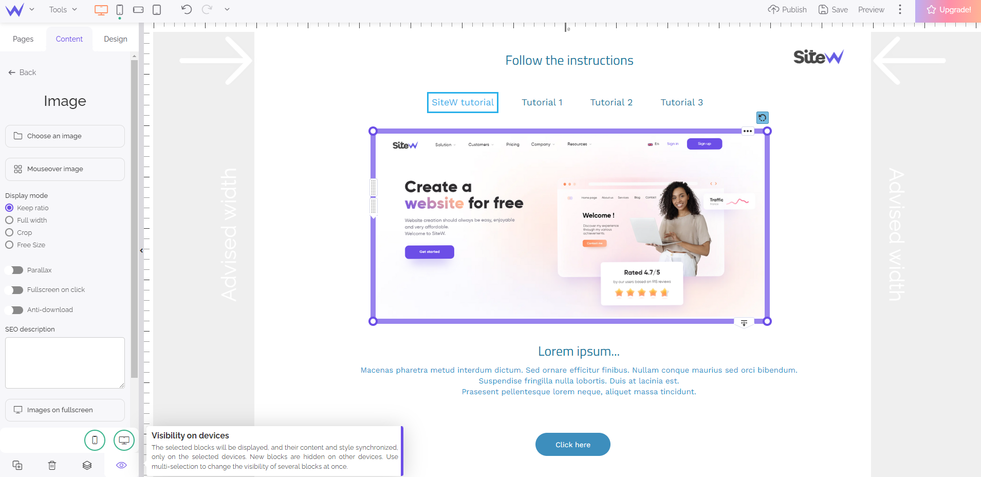
Each block, whether it belongs to the background page or any other page of the website, can be displayed or hidden depending on the view (desktop or mobile) in which it’s displayed.
To set up this visibility, just select the block and move the mouse over the “eye” icon in the left panel.

This block is displayed in the mobile view (red circle) and hidden in the desktop view (green circle)
When you are on the desktop view, and you add a new block:
- If the automatic mobile view is activated, this block will also be displayed on the mobile view as its default.
- If the manual mobile view is activated, the block will be hidden on the mobile view as its default.
If you add a block to a manual mobile view, it will also be hidden on the desktop view as its default.
Where is my block?
If you think you have ‘lost’ a block, it’s probably hidden on the current view. To find it, go to the view where the block is displayed. Don’t worry:
it’s impossible to hide a block on all the views simultaneously!
Mobile Bar
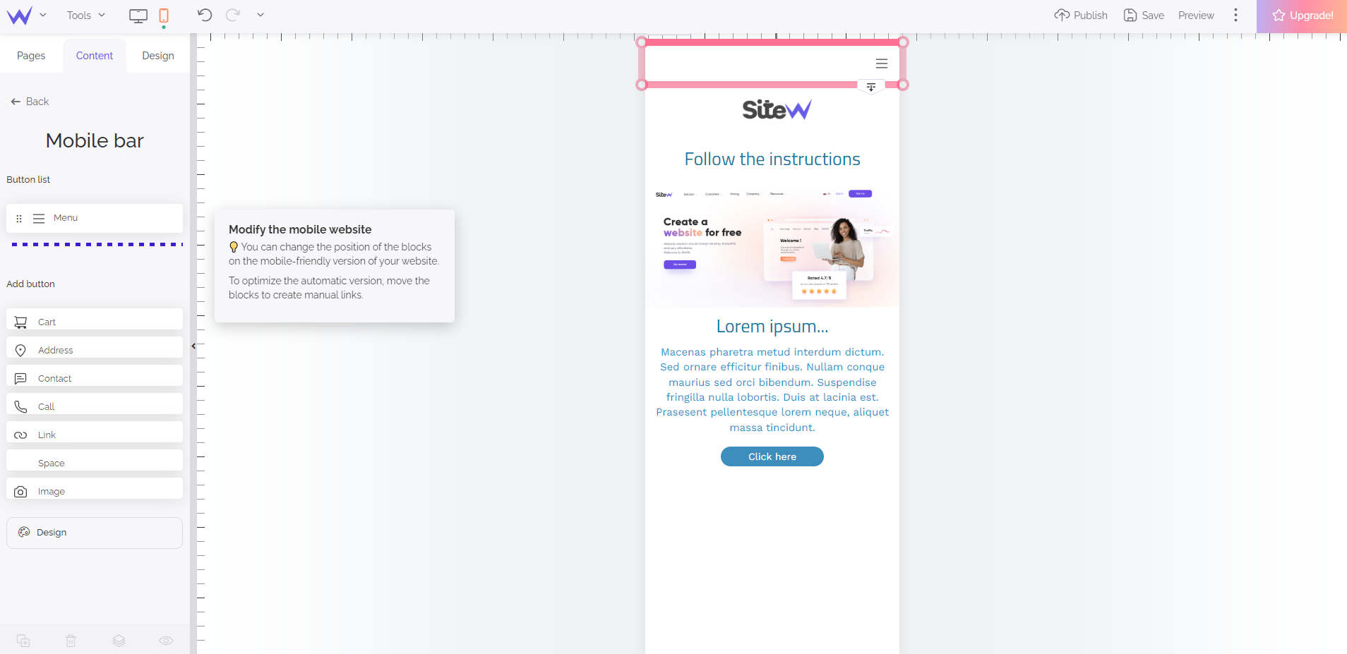
Whether it be in the manual or automatic mobile view, you can customize the mobile bar.

Preview of the Content tab when the mobile bar is selected
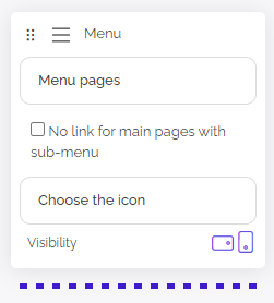
Please note that you can customize the menu of the mobile bar, including in the list of pages presented when you open the menu. So, it’s possible that the menu in the mobile view may be different from the menu in the desktop view.

The ‘manage pages’ button enables you to customize the pages listed in the mobile menu
Where is my menu?
You have added a Menu block in your desktop view, you have checked your block was displayed in the mobile view but you can’t find it? It means that you are in the
automatic mobile view! The automatic mobile view hides the Menu blocks to display the menu that the mobile bar offers. To keep a Menu block displayed in the mobile view, you must choose the
manual mobile view.

