
SiteW makes website creation easy and enjoyable thanks to a solution without technical or financial constraint.
Testimonials, interviews and examples of created websites. Discover our users’ reviews and creations.
Our history, news and commitments. Beyond online service, discover SiteW.
All resources at the service of your online presence.
11 minutes
You have a great project in mind: a startup, a growing nonprofit, an event to organize, or perhaps a business you’ve been dreaming of launching for years.
Now, all you need is a clear, elegant, streamlined website to bring it to life.
But not just any website.
A minimalist website—one that gets straight to the point. 🎯
The good news? Today, you can create a professional, minimalist website yourself—without hiring an overpriced agency 💸 or needing a degree in computer science.👨💻
You just need to know where to start… and how to create a website that’s both minimalist and effective.
In this article, we’ll break it all down together, step by step, so you can build an online presence you’ll be proud of—and that your visitors will love browsing.
Ready? Let’s get started—no frills. 🚀
Before choosing a website builder or settling on a design, take a moment to think things through..
Minimalism isn’t simply about “using fewer elements.” It’s about keeping only what truly matters. and choosing, with surgical precision, what actually deserves a place on your website.
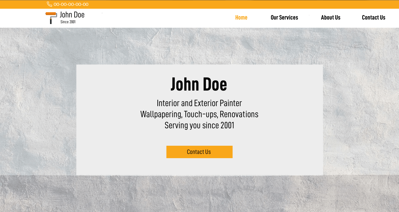
First and foremost, ask yourself the right questions:
Why do you want to create this website?
To showcase your business?
Sell products?
Get quote requests?
Share content?
What’s the main action you want visitors to take?
What information is truly essential?
A minimalist website is built around a clear purpose. If you try to say everything, show everything, and sell everything at the same time… you’re already drifting away from minimalism.🤷
Putting together a project brief for your website will help you stay on track. Even just a few lines will do. 📄✍️
Write down:
Your specific goals (visibility, sales, brand awareness, leads…)
The resources you have available (time, budget, skills: beginner or expert level…)
The style you’re aiming for (clean and corporate, warm and authentic, ultra-modern, minimalist…)
The essential pages
This step will help you determine:
The right website format (showcase, blog, online store, landing page…)
The type of technical solution to prioritize
Minimalism isn’t just about design. It starts with your strategy.

It’ll gently remind you—when you’re tempted to add a sixth section titled “Our Values in 17 Sub-Sections”—that no, it probably isn’t the idea of the century. 😉
There’s no single best solution for everyone. It’s all about finding the one that best fits your profile and your project. 🤝
Basically, you have two options:
Use a CMS (such as WordPress, Joomla, or Drupal)
Use a website builder (such as SiteW)
Let’s take a closer look…
A CMS (Content Management System) allows you to create a highly customized website using themes and plugins.
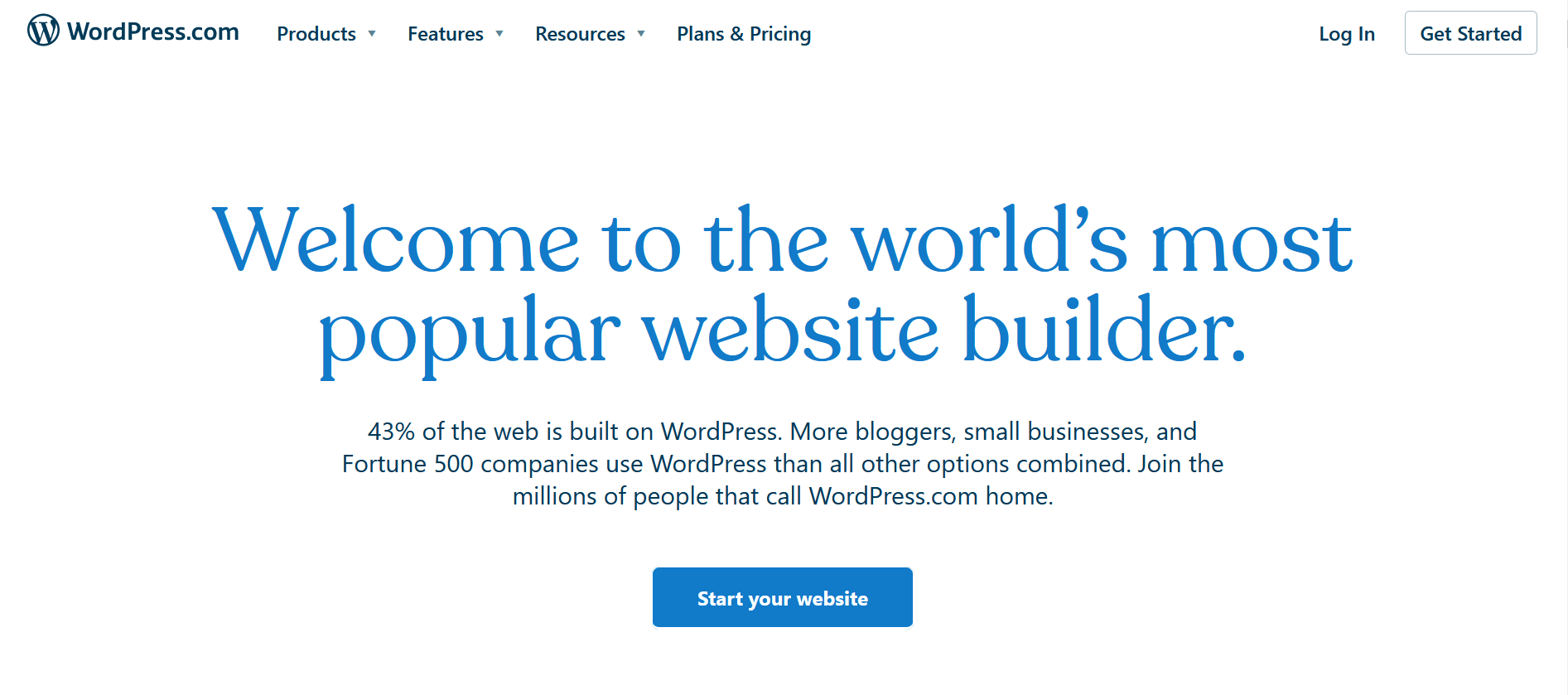
Advantages:
High degree of customization
Rich ecosystem
Significant scalability
But there are a few things to keep in mind: ⚠️
The learning curve can be steep (you may need to spend quite a bit of time browsing forums and personal blogs to figure out how plugins work)
Technical maintenance has to be handled without assistance (you’ll need to take care of updates and manage security yourself)
Performance is self-managed
If you’re aiming to create a minimalist website, a CMS can be an excellent solution… provided you have some technical knowledge or are willing to invest a fair amount of time in learning the ropes.
Website builders are designed to make website creation accessible to everyone.
Here’s how it works:
You choose a predefined template based on your business or automatically generate a design using AI
You edit the elements with your mouse 🖱️
You preview your changes in real time, without having to switch between tabs
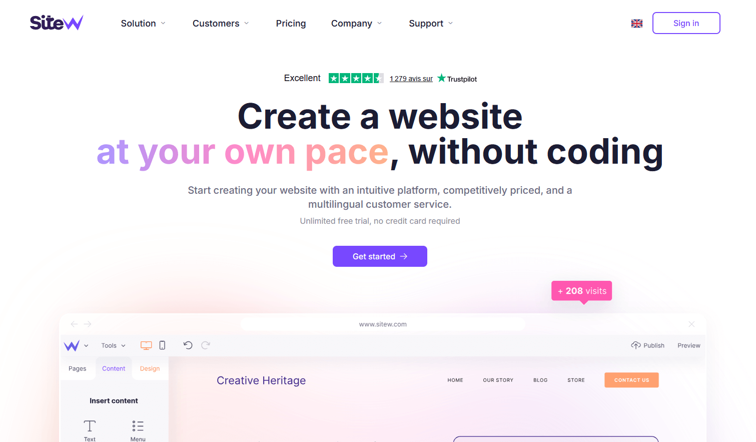
Advantages for a minimalist website:
An intuitive interface that’s easy to use even without any technical knowledge
Templates that are often already streamlined for maximum efficiency
Hosting and security included: you don’t have to worry about a thing; even the domain name and professional email addresses are already included in the all-in-one packages
Personalized customer support in English that’s readily available and easy to reach, so you can quickly get answers tailored to your questions.
You save time, minimize technical complexity… and can focus on what matters most: your message and your design.👌
Visual minimalism isn’t enough. A truly successful website also relies on a solid technical foundation. 🧱
Your website must be secured using the HTTPS/SSL protocol.
That little green padlock inspires trust, while a “Not Secure” warning can scare away even the bravest visitors.
HTTPS helps ensure:
Data protection 🔒
Visitor trust
Better SEO (and greater visibility on Google)
A minimalist website should inspire a sense of calm. 🧘
A “not secure” warning definitely doesn’t. 😕
Minimalist doesn’t mean incomplete.
A website till needs to comply with a number of mandatory legal requirements.
Be sure to include:
Legal notices
Privacy policy
Cookie policy, if necessary

A cookie is a small text file that a website stores on your computer, smartphone, or tablet when you visit it.
It allows the website to remember certain information about you, such as your preferred language, the contents of your shopping cart, your login credentials, your display preferences, and your browsing activity for statistical or advertising purposes.
A minimalist website should be:
Fast to load
Fully readable on mobile 📱
Easy and enjoyable to navigate
Minimalism naturally enhances performance: fewer elements, fewer heavy scripts, fewer overloaded images.
And that’s good for your visitors… and for Google!

… We take care of all these aspects for you: from securing your website to optimizing its technical performance (including file compression for faster loading and Menu or Button blocks to enhance the user experience, among other features).
Got everything figured out? 🧠
Then let’s get started… 💪
Look for a template with:
Plenty of white space
Clear typography
A simple structure (not too many graphic elements, no excessive animations…)
A limited color palette
If the template is already overloaded with features, you’ll have a hard time stripping
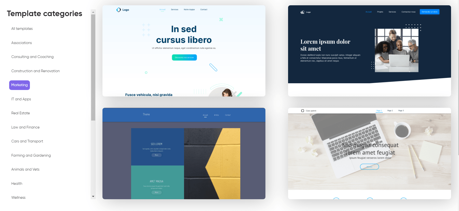
On our platform, you’ll find the following tabs in your content creation interface:
A “Pages” tab
A “Content” tab
A “Design” tab
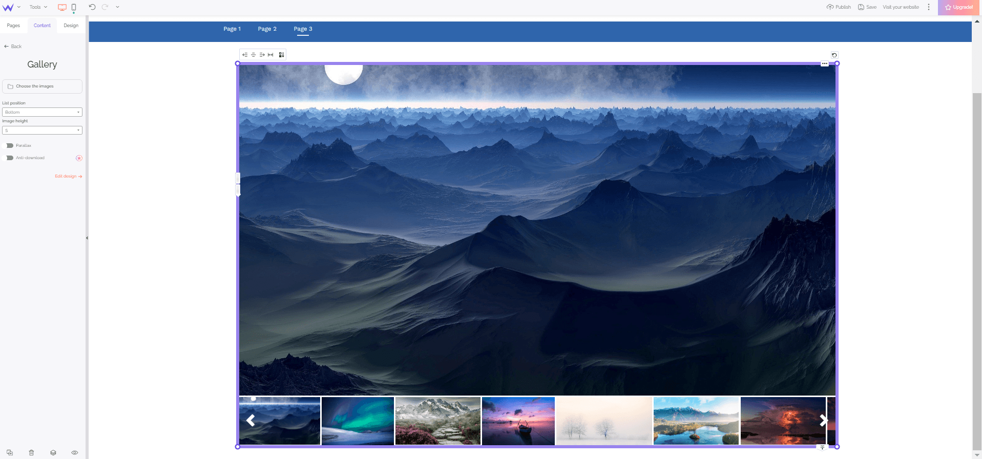
Organize your pages logically:
About
Services / Products
Contact
You don’t need 18 sections. Each page should serve a specific purpose.
Minimalism rests on three pillars:
Structure
Design
Content
Let’s explore them together…
Your sitemap should be:
Logical
Intuitive
Hierarchical
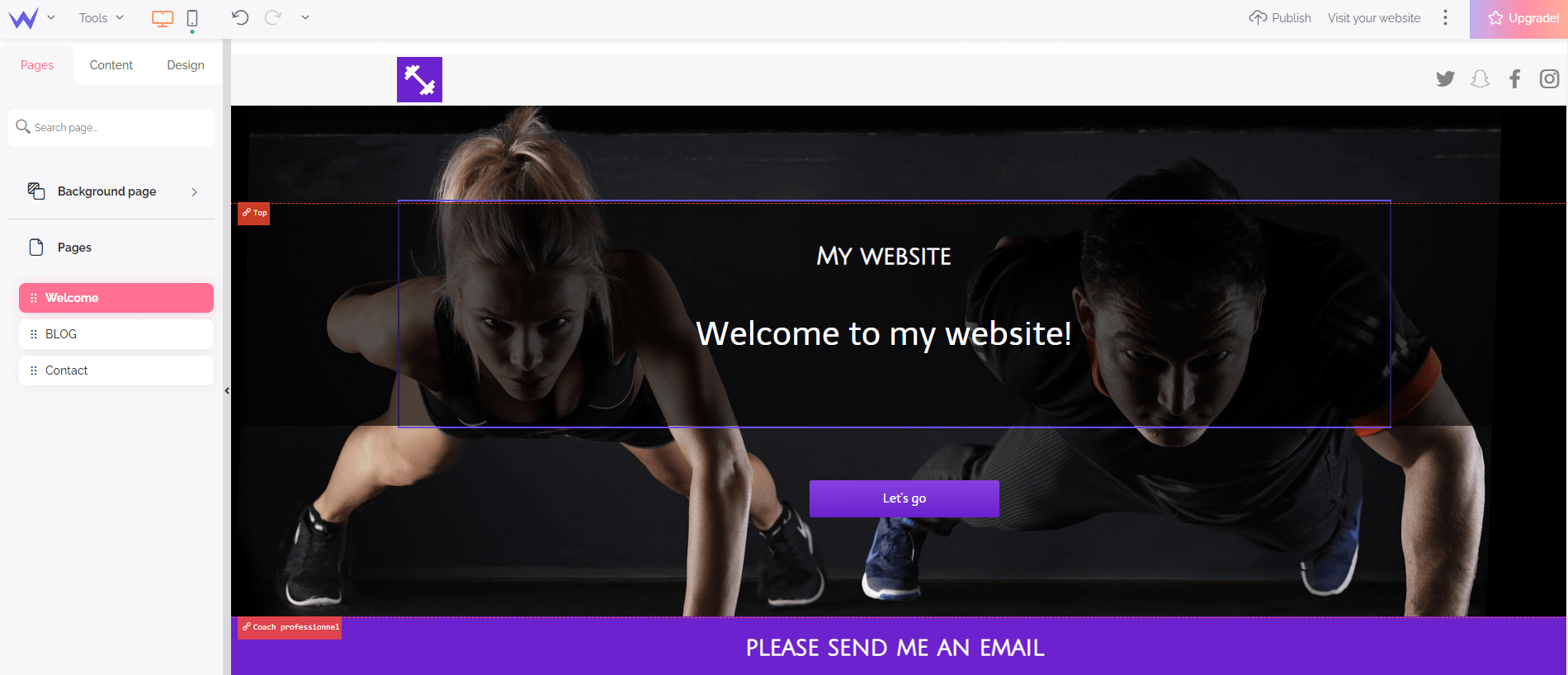
Link your pages together in a coherent way.
At SiteW, you can easily manage your pages in the dedicated tab. We’ll provide your website’s sitemap, while our artificial intelligence takes care of your internal linking.
For crystal-clear web pages, consider using:
Clear headings
Structured subheadings
Well-defined visual sections
Waia, our AI, will help you generate the ideal predefined sections for your website: all you have to do is talk to her directly in the web editor.
On our platform, you can create or customize these sections using:
Simple shapes (circles, rectangles, lines, stars…)
Horizontal bands
Subtle backgrounds (solid color, gradient, understated photo, etc.)
Separators
But remember: every element must serve a purpose. Otherwise… out the door it goes🚪.
A successful minimalist design relies on...
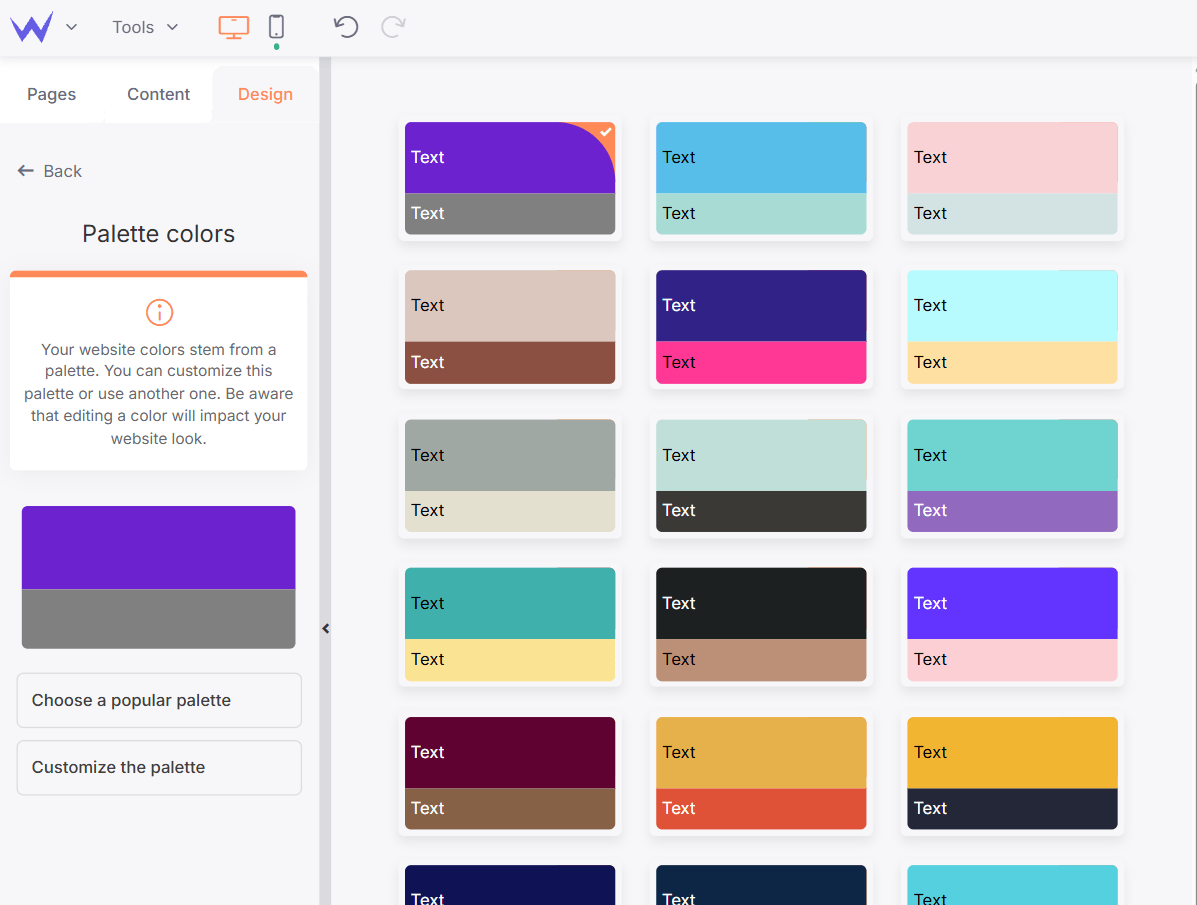
A maximum of 2 to 3 colors 🌈
A primary color,
An accent color
On our online platform, you can choose from predefined harmonious color palettes. Our AI agent can also guide you and offer advice on your color choices. 🎨
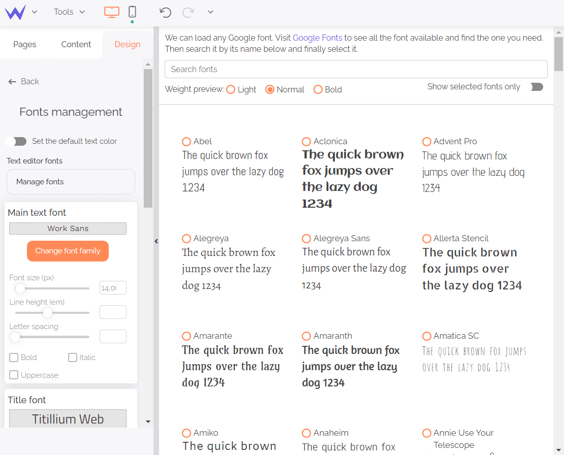
A maximum of 2 or 3 fonts
Readability should always take precedence over originality
Clear hierarchy (headings / subheadings / body text)
☝️ Empty space isn’t just empty.
It gives your design breathing room, improves clarity, and creates greater visual comfort. 👀
Here’s a non-exhaustive list of effects that work well with a minimalist aesthetic:
Changes on mouseover (photos or buttons)
Slight zoom effects (on images)
Fade or subtle slide (for slideshows)
Conversely, avoid:
Excessive bouncing
Spectacular 3D rotations that make you feel seasick 🌊
“Digital carnival” effects 🎪
Minimalism thrives on subtlety. And that works out perfectly, because those are exactly the kinds of elegant animations we offer in our web editor.
Your content is the heart of the site. ❤️
That’s why it must be precise, useful, and free of unnecessary fluff.
Add:
High-quality images 🖼️
Relevant videos when necessary 📹
But above all, remove anything unnecessary.
To do this, always ask yourself one question: “Does this information actually help my visitor?”
Depending on your business, you can include...
Text
Images
Videos
Call-to-action buttons
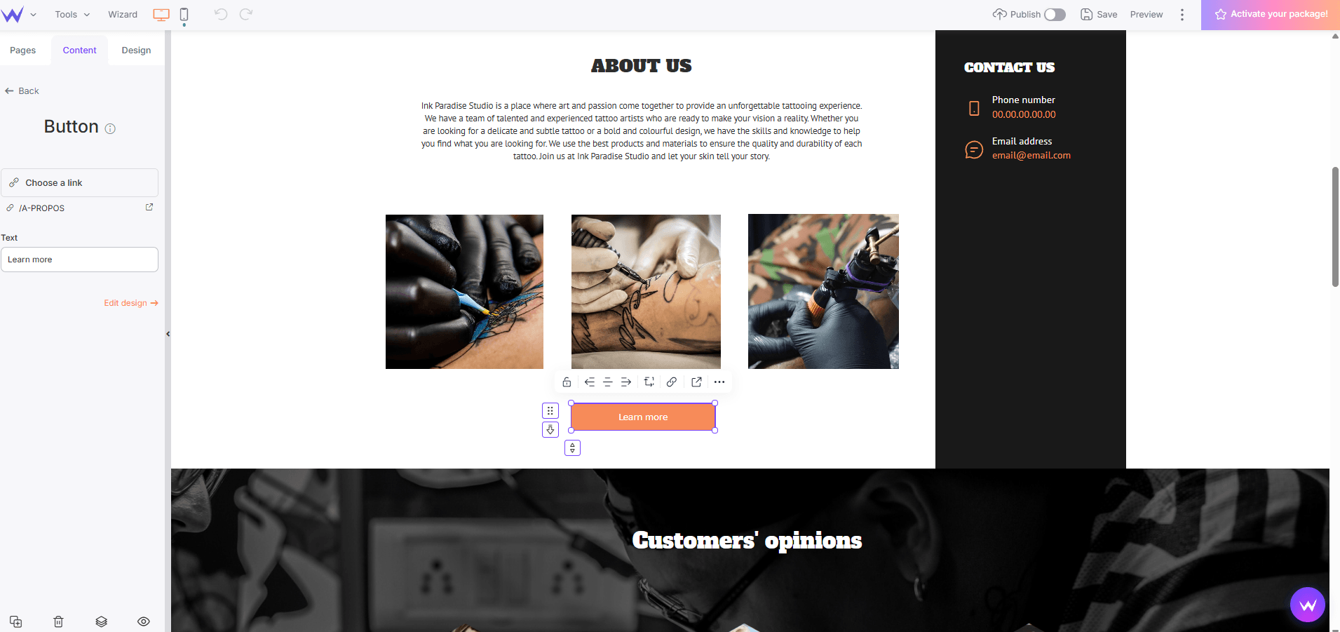
Hours of operation
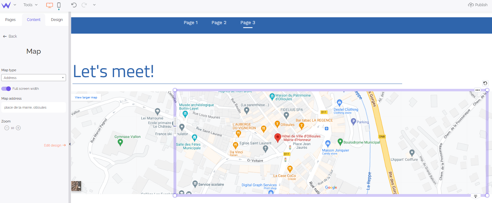
Location map 🗺️
Document downloads
Contact form 📝
Blog
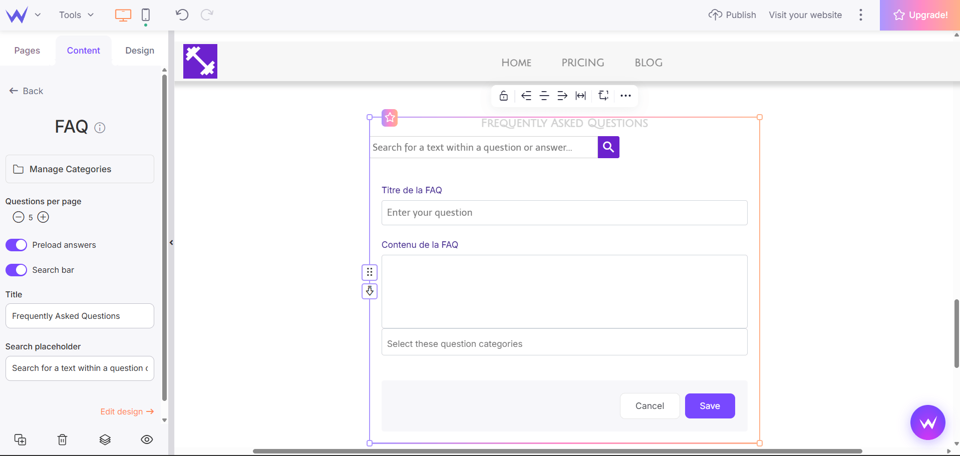
FAQ
Comments
Newsletter
Social media links
Use these sparingly.
A minimalist website can also easily include an online store: 🛒
High-quality photos
Clear pricing
Inventory management
Secure payments
Shipping options
Promotions
Automated billing
The key? 🗝️ A clear interface and a streamlined checkout process.
Is your website live? Congratulations! 🙌
But the work doesn’t stop there…
To increase your visibility online, consider:
Running a blog
Posting regularly on social media
Taking part in webinars 💻
Writing guest posts for other websites
Engaging with professional communities, such as LinkedIn or Facebook groups
These strategies can help you earn backlinks (external links pointing to your website), which are incredibly valuable for building brand awareness and strengthening your online presence. 🔗
A backlink, also known as an inbound link, is a link from another website that points to a page on your site.
Backlinks play an important role in search engine optimization (SEO) because search engines like Google can view them as signals of trust and authority.
Generally speaking, the more relevant, high-quality backlinks your website earns, the better its chances of performing well in search results.
Minimalist or not, your website still needs to be optimized for search engines.
Here are a few SEO essentials:
Create well-structured, useful content that naturally incorporates relevant keywords
Use your main keywords strategically in titles, headings, introductions, and throughout your content
Optimize your metadata, including title tags and meta descriptions
Keep your content fresh and up to date 🔄
You should also connect your website to:
Google Search Console
These tools provide valuable insights into:
How visitors interact with your website
Which pages perform best
Where there’s room for improvement
A minimalist website combined with a smart SEO strategy can be a powerful recipe for online success. 👑
👉 Françoise Lunardi’s biographer website features:
A highly structured homepage
.png "example of minimalist website")
Clear, well-defined sections
A prominent contact form
A concise yet informative overview of her values in just a few lines
👉 The fantastic online store run by the beekeepers at Rucher de Lagarde:
Showcases their products with crisp, high-quality photos 🍯🐝
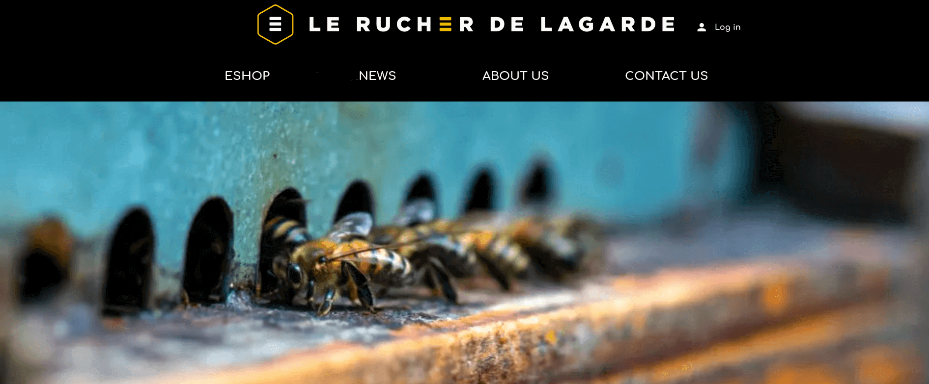
Offers a simple, well-organized shopping experience
Tells their story in an authentic way
👉 The “La Villa Mouneyra” guesthouse in Bordeaux makes great use of its beautiful website to:
Showcase large, immersive photos
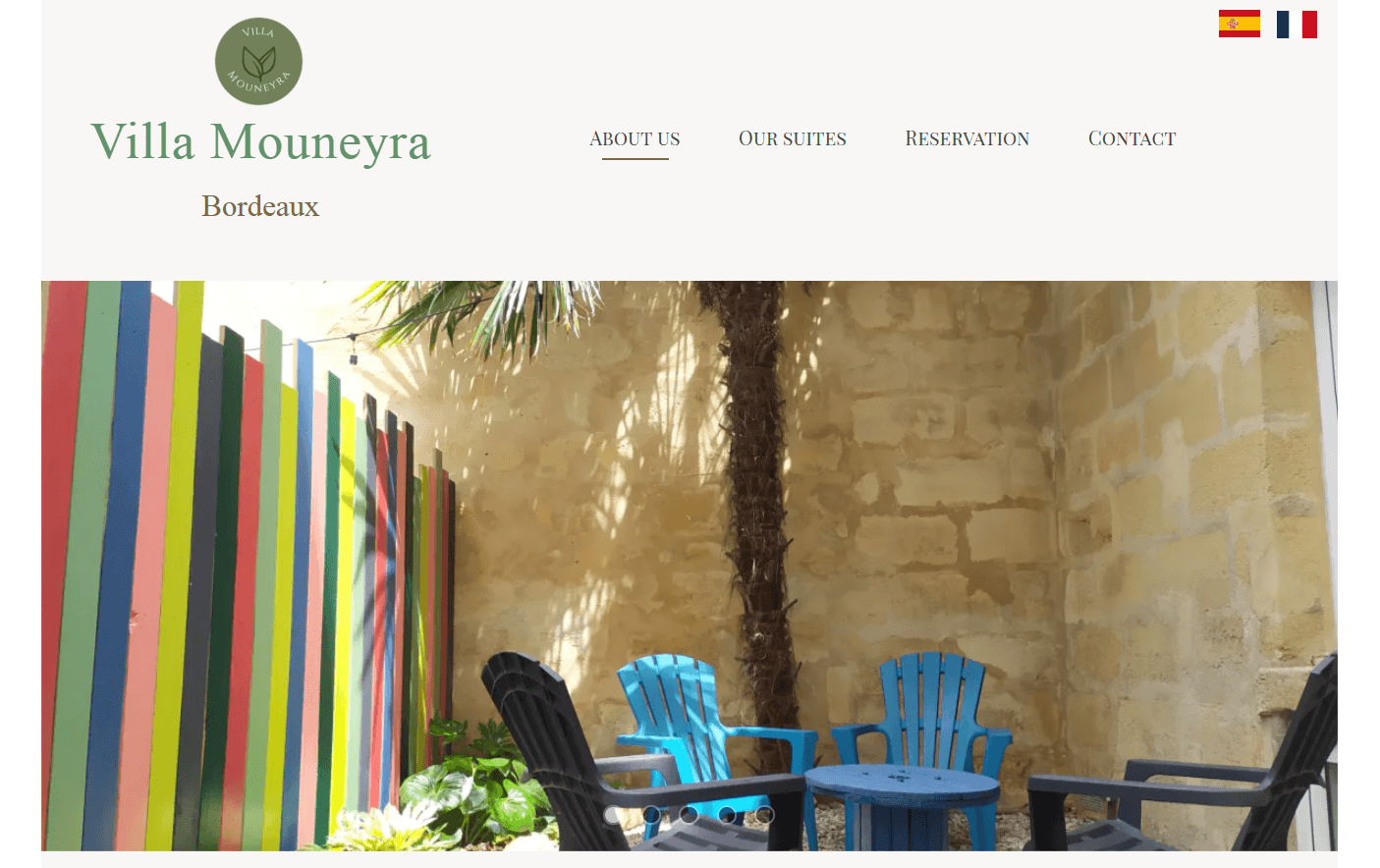
Clearly display packages and rates
Feature a prominent “Book Now” button that immediately catches the eye
👉 “La Maison Palotte” in the Hautes-Alpes makes excellent use of its stunning minimalist website to:
Organize information clearly
Make it easy for visitors to book or request additional information
Include testimonials and contact information
In every case, the same common thread emerges:
Seamless navigation
Consistent design
Easily accessible information
A pleasant user experience
Creating a minimalist website doesn’t mean doing a “worse” job. It means doing more, with less.
All you need is:
A clear purpose
A well-thought-out structure
A clean design
Precise, focused content
A solid visibility strategy
Today, with a little method and perseverance, creating a professional minimalist website is well within your reach.
And if you’re still hesitating to remove that third neon purple button… Take a deep breath… And delete it. 🤗
Your website (and your visitors) will thank you. 🙏✨
Last update: September 30, 2026